I thought today we'd concentrate a little more on our rabbitry website than our actual rabbitry!
It's a much debated topic on Rabbit Habbit- by which I mean, it tends to pop up occasionally, and we are often asking opinions on new changes to our sites!
Now, before I get down to the nitty gritty, I want to mention- your website is YOURS. Do what you want. If you want to make it neon green with hot orange text, go for it. These comments are meant just to help those who are interested with little things that could make your site more accessible, more readable, and more pleasing to the eye! It's compiled of pet peeves I have or I have heard of- usually 75% of more of the folks I've talked with agree.
1.) Stick with one background.
It looks more professional. I get around this by changing the look of my website- pretty much when I feel like it. :)
2.) Don't have music
I keep my computer speakers turned off, but there is nothing more obnoxious than trying to listen to your own music and find a site that has something else playing! Especially if you hate the genre- ie. Rap or Country- or whatever. It can also slow down the load time for the poor folks stuck on Dial Up Island.
3.) Go easy on the blinkies, glitter pictures, etc.
This also slows load times, doesn't look professional and can clutter an otherwise nice page. Try to keep these to a minimum.
4.) Keep colors simple.
Like I said at the beginning- if you have a neon green background with bright orange text- good for you. I won't be visiting your site more than once ever though. The overly bright colors kill my eyes (and those of others!). I don't like squinting or having to highlight text to read it. Try to consider if it's easy for your customers to read your text- after all your website is geared towards them!
5.) If you can, try not to be redundant, if you can.
Do you have an "About Me/Us" page? If so, you probably don't need to copy paste the introduction on the index of your rabbitry to that page and vice versa. Either have a detail Intro or have a detailed About Us page. Example of a good compromise:
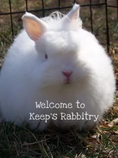
Intro: Welcome to Keep's Rabbitry. We're located in Western NC and consist of a husband/wife team.
About Us Page: Names, ages, how long we've been in rabbits, favorite breeds, why we breed the ones we have, hopes, dreams, pictures, etc.
Obviously, this is very short and scaled down, but I hope it does help to serve an example!
6.) Have pictures!
Preferably good pictures, in good lighting. Some folks prefer websites they visit to have all the animals on the same background. I'm lazy in the pictures department, so I don't really care about that. Pictures are definitely hard for me to get- my animals dislike posing and love to torture me by running around. However, I try to make sure the pictures aren't squished, are in good lighting and aren't fuzzy!
7.) Don't make me chase your links!
I hate searching through 300 links to find the one I want. Try to keep it simple. If you have more than 1 breed and don't want to just do a "Bucks" and "Does" page, keep the breeds together! Holland Bucks, Holland Does, Holland Juniors. Polish Bucks, Polish Does, Polish Juniors, Flemish Bucks...you get the picture!
I also hate clicking "Does", getting to "Hollands", then getting to "Brokens" or "Solids" , then to "Seniors" or "Juniors".....see how irritating it was just to read that sentence? I tend not to visit sites that make me hunt to see what I want to see.
-Kristen
Keep's Rabbitry
Subscribe to:
Post Comments (Atom)

1 comment:
Perfect! I hope some decide to take some of your advice, thought it is whoever's decision. :)
Post a Comment